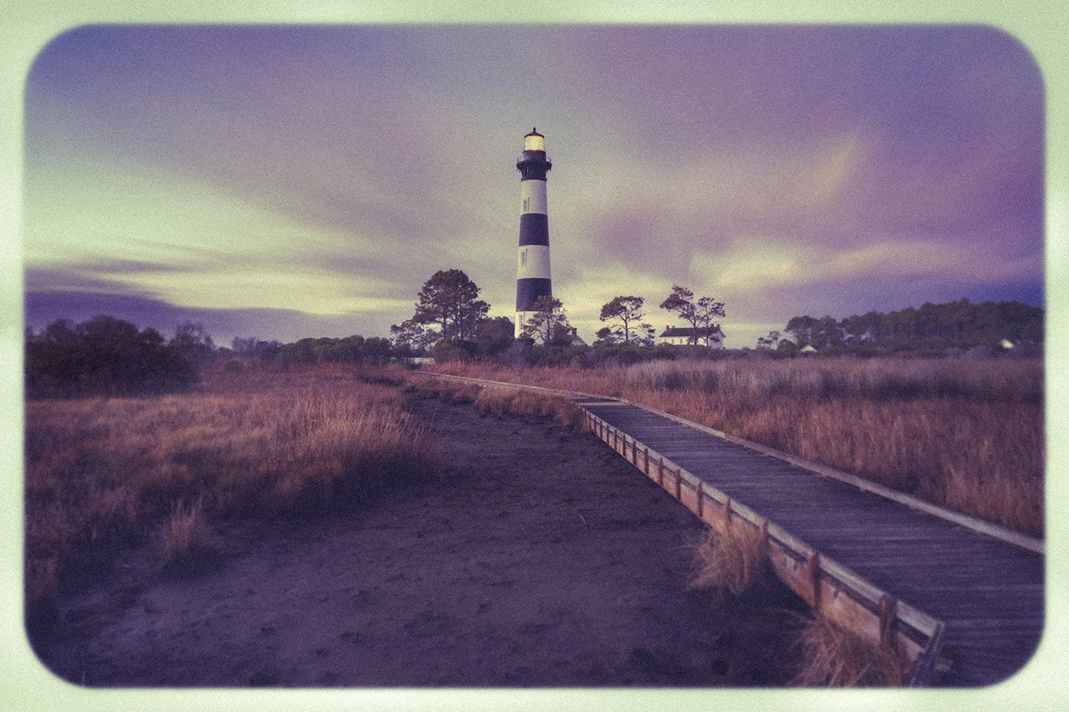
Bodie Island Lighthouse — the image that inspired the Vintage Series.
As I begin releasing prints from my Vintage Series, I wanted to share the story behind the project—and how it breathed new life into my enthusiasm for photography.
A Finished Edit That Didn’t Feel Finished
Fresh back from a seaside excursion, I had just completed an edit of the Bodie Island Lighthouse. To me, it was a dramatic scene done right: motion in the sky, a dry marsh foreground lit by clean golden-hour light, and a rugged walkway acting as a leading line.
Some might say the vibrance and saturation should be dialed back. But I edit as I remember the scene—vivid, dramatic, and momentary. Those rare moments when the light presents itself in a rich, brilliant form.
Yet as I looked at the image glowing on my computer screen, something seemed off.
I liked the photo—but it felt digital.
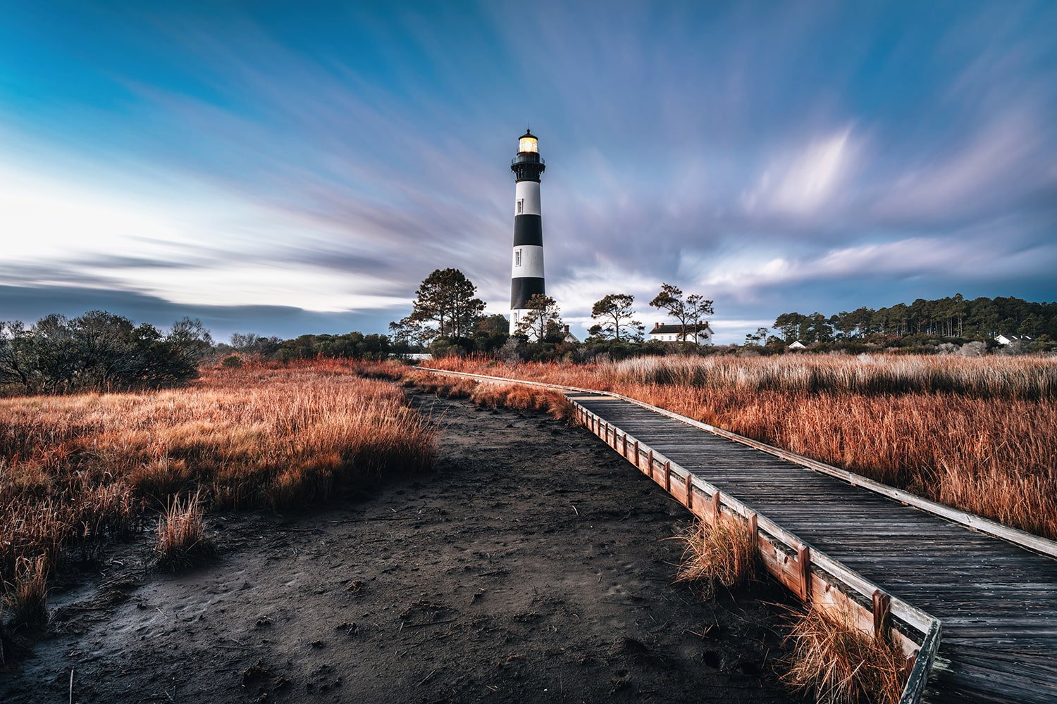
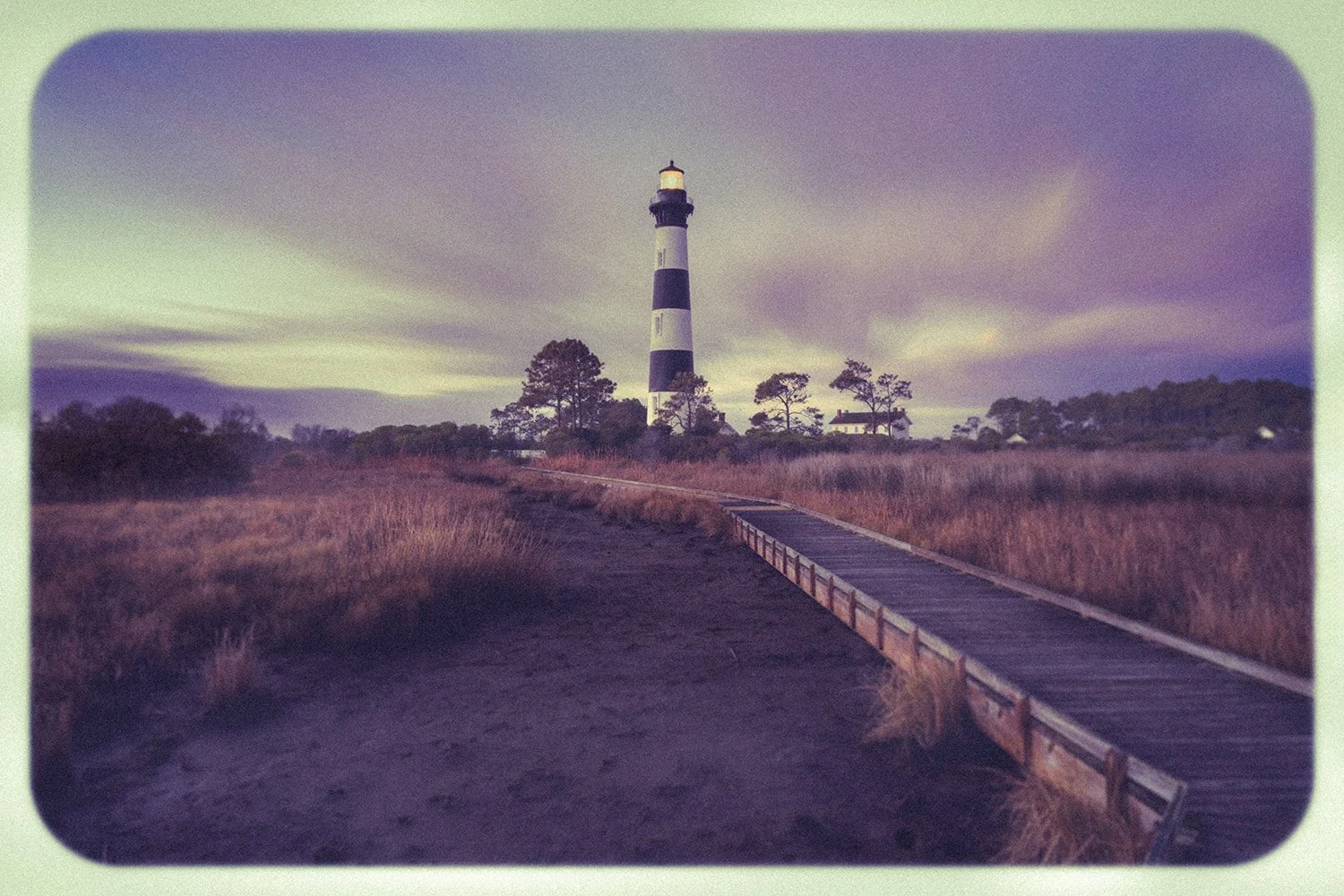
The same photograph before and after the Vintage Series edit.
When Digital Perfection Loses the Plot
As photographers, we’re surrounded by megapixels, stacked sensors, and shooting speeds fast enough to make a Formula One car feel sluggish.
Somewhere along the way, I started to wonder if we’ve lost focus on the actual subject of our photographs.
This image reminded me of the 4-zone heated vest I wore on a cold December morning while framing the shot—not the harsh, isolated life of a lighthouse keeper, or “wickie,” battling wind, cold, and solitude.
The same thought came back as I looked at a photograph I took of a bull elk in the Cataloochee Valley. I found it with GPS guiding the way, Spotify filling the silence, and a climate-controlled vehicle carrying me comfortably to the trailhead. The wildlife photographs of the 1950s, 60s, and 70s may not hold up technically, but many seem to carry ruggedness born from paper maps, long drives, uncertain conditions, and the simple fact that getting there was often part of the story.
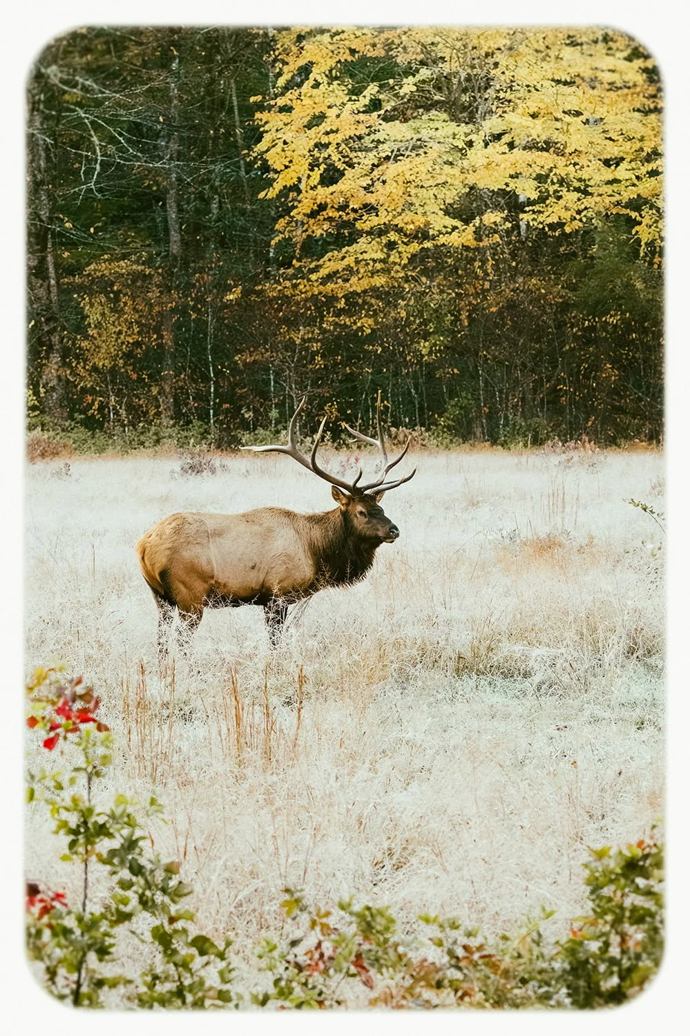
In the Cataloochee Valley, the bull elk carries its own quiet authority through a landscape that feels unchanged by time.
These disconnects made me stop and question my work.
The Need for a Personal Photography Project
Like most photographers eventually do, I found myself considering a side road—a personal photography project.
Personal projects matter. They can:
Restore creative focus
Break creative ruts
Encourage technical and artistic growth
Help form a more meaningful body of work
For me, this project became something to quietly obsess over at night—a creative outlet which seemed necessary rather than optional.
The challenge was easy:
Could I edit images in a way that made me feel them again?
What “Feeling” a Photograph Really Means
“Feel” is subjective—and often generational.
I love the convenience of my iPhone 15, but I miss the physical feedback of the physical keyboard on my old BlackBerry. My fingertips still search for texture on a smooth glass screen.
Describing a payphone to my niece and nephews, who grew up fully digital, is hard enough. Explaining the experience—dropping coins into the slot, feeling them vibrate through the mechanism, hearing them land in the vault like a pot of gold—feels almost impossible.
The same goes for rotary phones from my childhood home. My parents held onto those 1970s staples well into the 80s. Olive green, mustard yellow, beige, pink—take your pick.
Imperfection as the Point
That nostalgia led me to think about Polaroid instant cameras—the whine, clack, and grind as they produced low-contrast, washed-out, blurry, heavily vignetted images, often tinted blue or orange.
Technically, those images were bad.
Yet today, that one-of-a-kind look is beloved—even among younger generations.
The blur. The color shifts. The flaws.
Imperfection is perfection.
That’s the feeling I decided to chase.
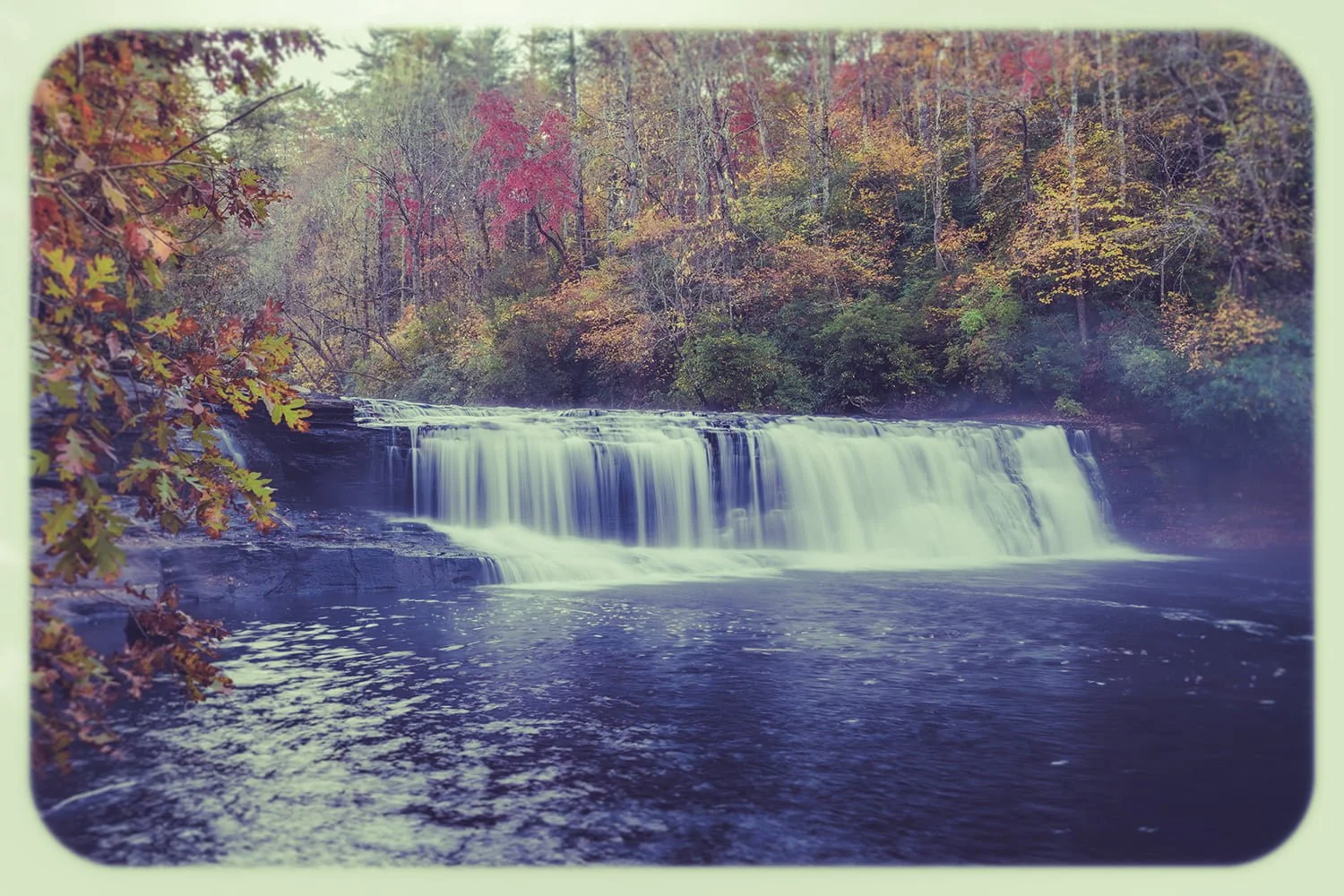
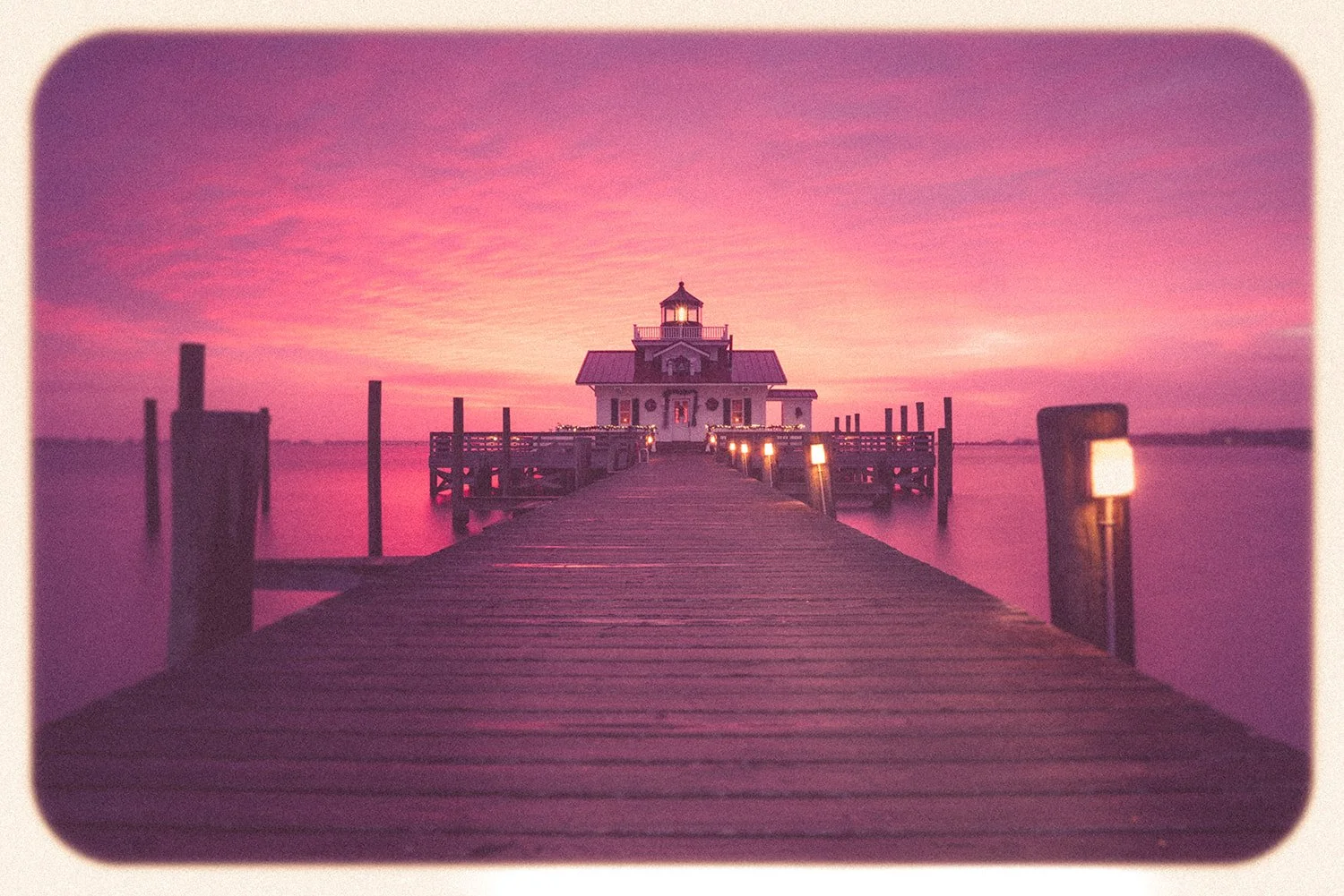
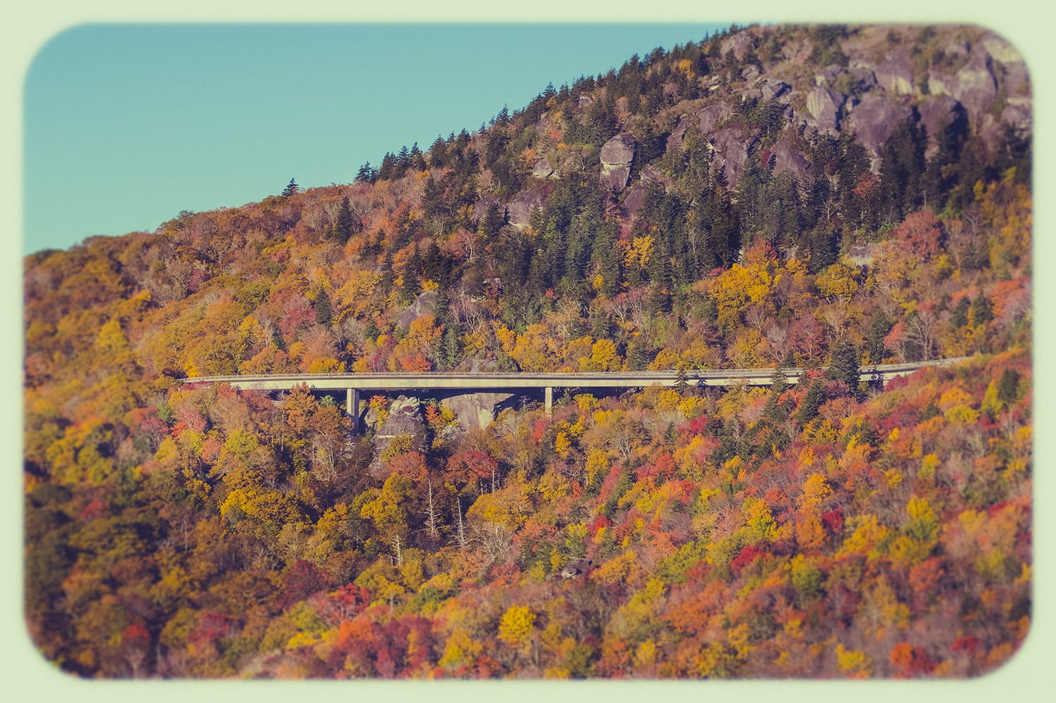
Reimagining the Lighthouse Through Film Inspiration
I asked myself how I could edit that lighthouse image to evoke:
Isolation and hardship
Creaking stairs
Gale-force winds
Distant foghorns
Rather than clinical sharpness and HDR vibrancy, strong enough to give the latest episode of Bridgerton a run for its money.
The answer was to study film.
Drawing Inspiration from Film Photography (1950s–1980s)
I began exploring the visual characteristics of film from the 1950s, 60s, 70s, and 80s—not to recreate them exactly, but to draw inspiration from each era’s look and apply it intentionally.
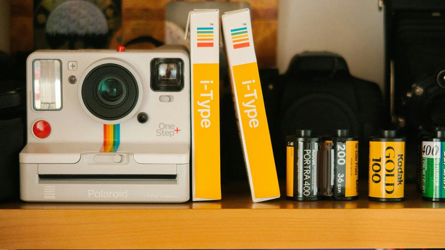
A Polaroid camera and film canisters—reminders of a time when photography was physical, unpredictable, and full of anticipation.
As a child of the 80s, when my photography roots were sewn, I was tasked with figuring out which film to use for family vacations. I remember the bold contrast of Fuji Superia 400 and the saturated color of Kodacolor Gold 100. Kodak’s magazine ads—“The accepted standard of color shattered”—left a lasting impression on me.
Clearly, the seeds of my preference for bright, vivid colors were planted here.
A Brief Look at Film Eras
Each era developed a particular visual character—a culmination of camera design, film chemistry, and the culture of the time. Below is a brief guide to the predominant looks, tools, and film stocks which defined each decade.
1950s Film Photography
Look:
Elegant tones, center-weighted sharpness
Cameras:
Rolleiflex TLR (Twin Lens Reflex), Leica III / M3 (35mm rangefinder), Kodak Brownie
Film:
Kodak Panatomic-X – fine grain, high sharpness
Kodak Plus-X – classic black & white look
Kodachrome II – vibrant natural color pallette
1960s Film Photography
Look:
Balanced midtones, muted saturation
Cameras:
Nikon F, Canon rangefinder cameras, and continued use of Rolleiflex systems
Film:
Ilford FP3 – black & white with fine grain
Kodak Tri-X – gritty, high contrast
Kodachrome 25 / 64 – natural color with pop
1970s Film Photography
Look:
Earthy and raw, midtones emphasized
Cameras:
Canon 35mm SLR (AE-1)Pentax Spotmatic / K1000
Mamiya RB67, Pentax 6×7 (medium formats)
Film:
Kodak Tri-X 400 – black & white with strong character
Ilford HP5 – medium contrast, traditional grain
Fujifilm Provia 100F – muted, atmospheric colors
1980s Film Photography
Look:
Increased contrast and saturation, bolder images
Cameras:
Nikon F3, Canon T90 / AE-1 Program
Medium format: Hasselblad 500 series
The rise of compact consumer cameras from Kodak, Fujica, and Yashica
Film Influence:
While film stocks evolved, this era leaned heavily into bolder contrast, cleaner color separation, and faster workflows—connecting the divide between classic film aesthetics and the coming digital age.
Beyond the Film Stock
Other factors played an important role in shaping the look of each era:
Early lens designs focused on center sharpness
Darkroom techniques like dodging and burning were used to emphasize tones
Cultural context influenced contrast, colors, and subjects
Grain and soft edges were accepted and embraced in night scenes and motion
These characteristics weren’t flaws—they were part of the visual language.
Creative Freedom Without Rules
My goal was never to make a photo look like it came from a specific decade.
Instead, I allowed myself complete creative freedom—pulling characteristics from any era if they helped tell the story.
I moved out of the clinical digital lab and embraced:
Heavy grain
Muted or oversaturated color
Color shifts and “incorrect” tones
Soft edges
If it served the image, I used it.
The Process and the White Border
The process entailed a lot of trial and error. Each morning, as my coffee brewed, I revisited previous edits and selected a new image to work on.
I also decided to add a consistent white border to every image in the series. It creates a sense of separation from the digital world—like an actual photograph you could hand to someone.
Breathing Life Back Into the Work
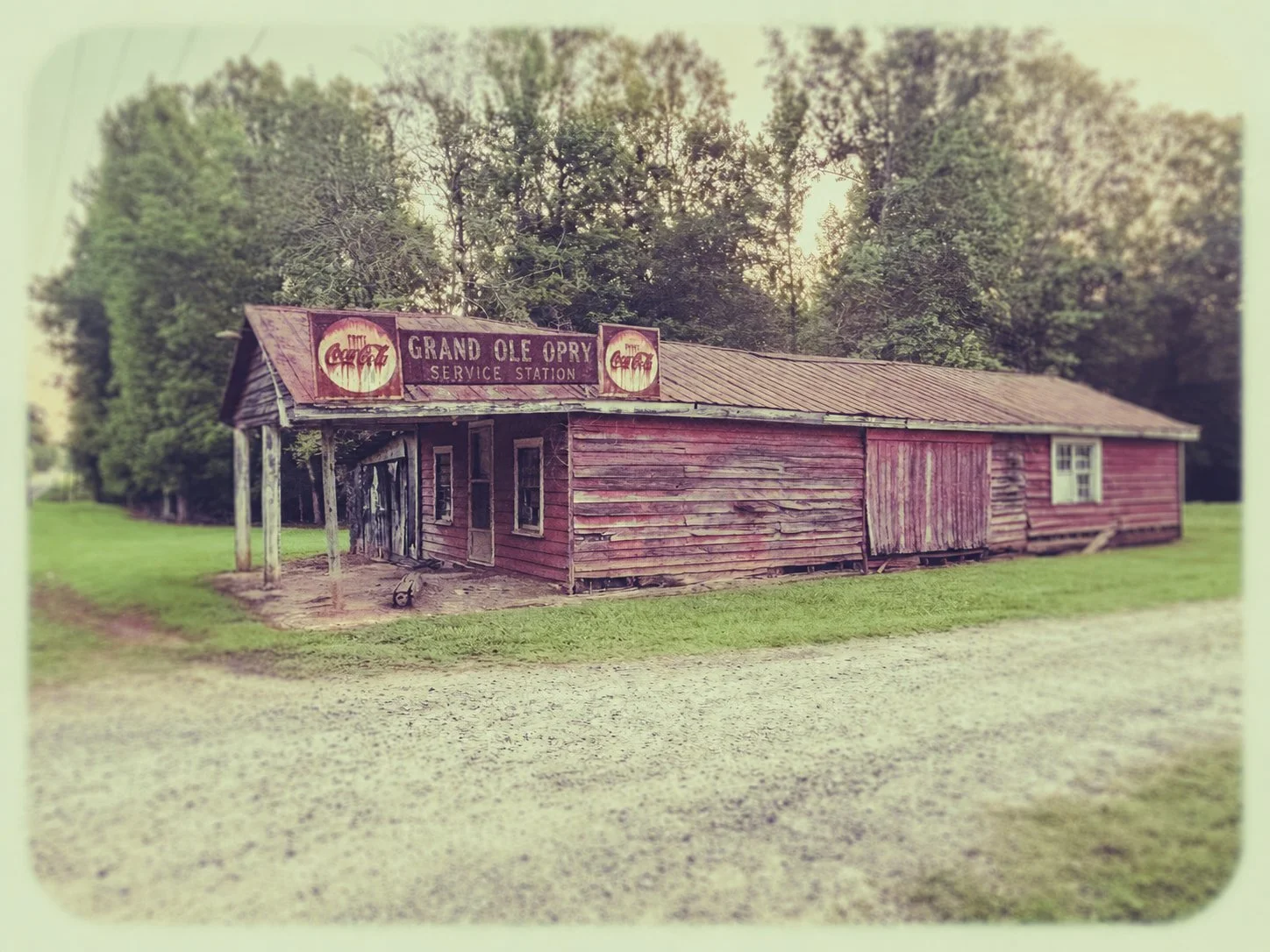
Grand Ole Opry Service Station-Oak Hill community, Oxford, North Carolina.
After about a month, I reviewed the re-edits.
These images appeared alive again.
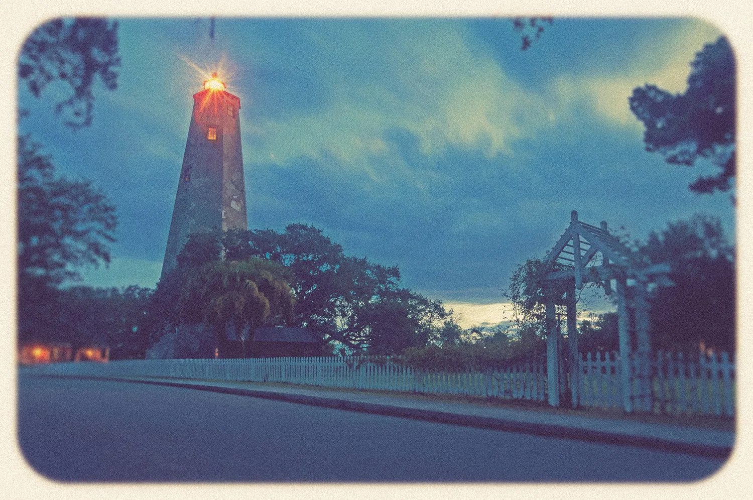
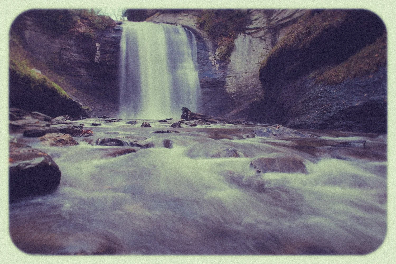
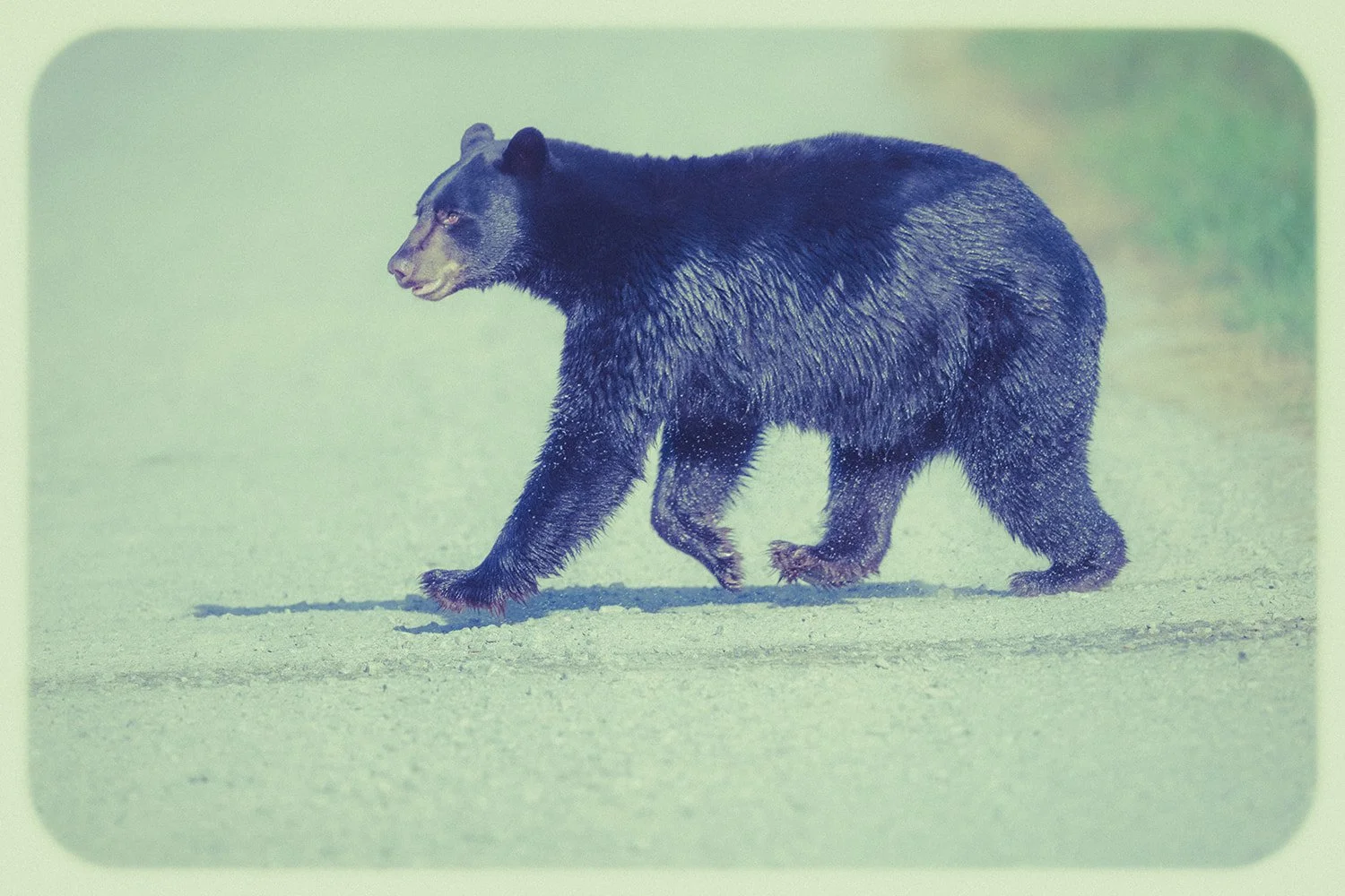
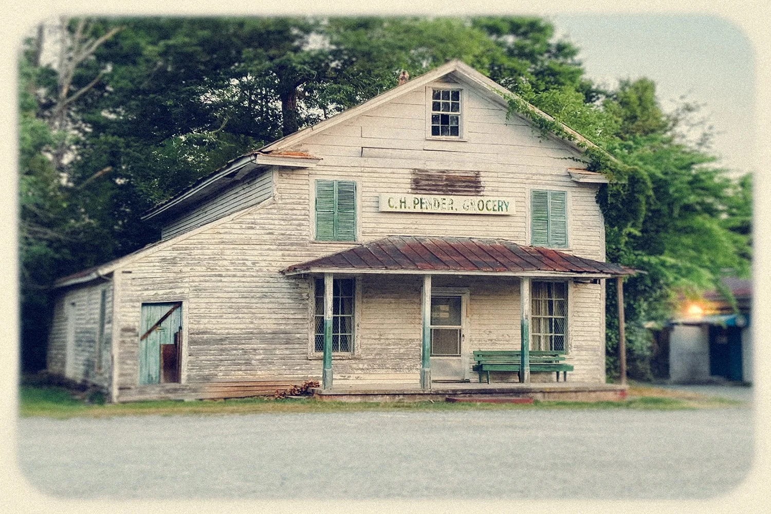
They felt like windows in time, not a trip through Willy Wonka’s chocolate factory. They invited questions. They encouraged lingering. They made me want to step into the scene.
This is the kind of project I needed to reengage senses numbed by the digital world.
I miss the film advance lever on the Pentax K1000 I learned on.
The sound of the shutter dropping.
The Kodak magazine ads and the crinkle of turning pages—replaced now via endless doom scrolling.
Moving Forward with the Vintage Series
I plan to continue expanding the Vintage Series, offering curated fine art prints in 8×12 sizes, printed on Aquarella Rag Fine Art paper to complete the vintage aesthetic.
This project has breathed new life into my passion for photography—and that alone makes it worth pursuing.
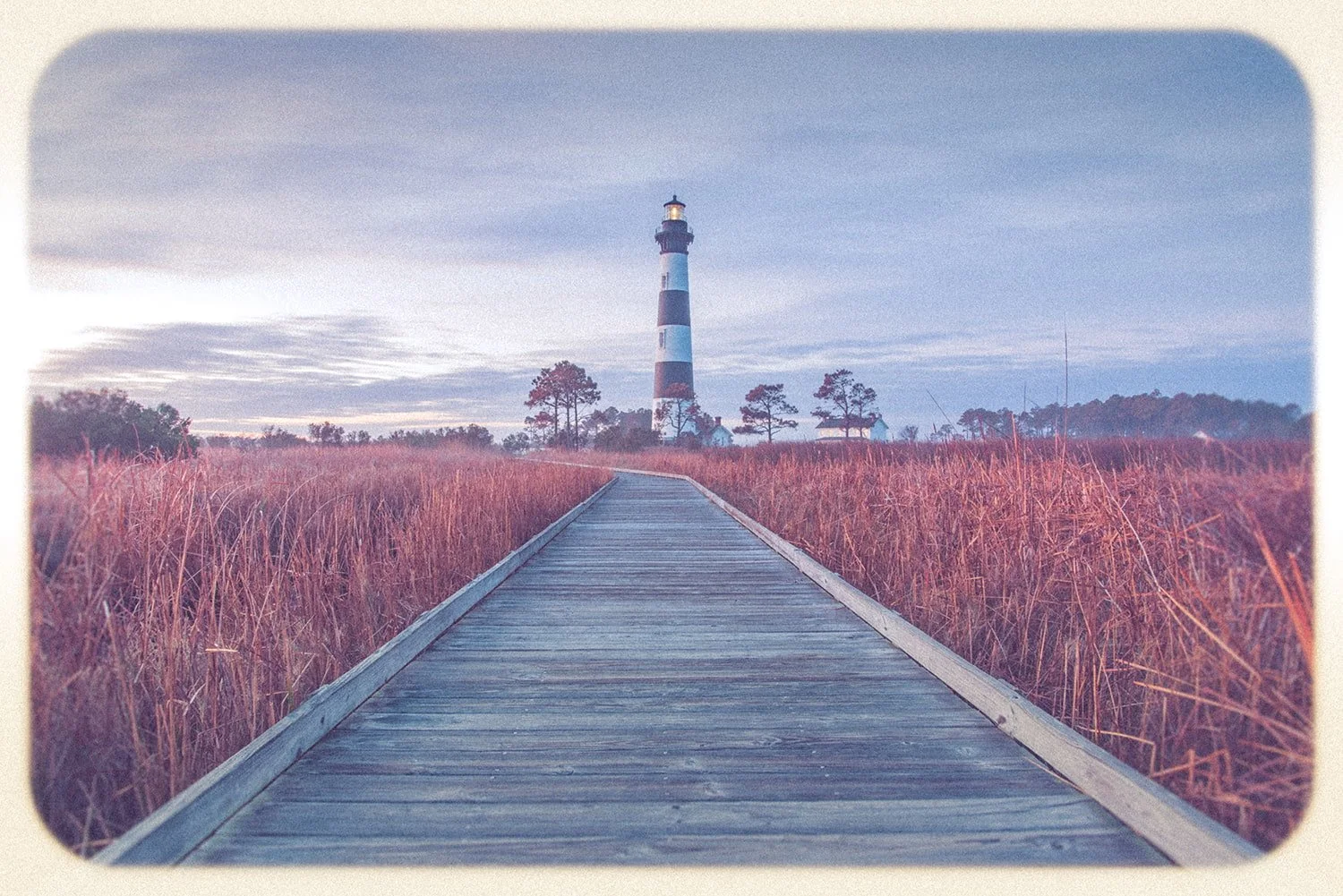
Bodie Island Lighthouse, reimagined through the Vintage Series—where mood and memory take precedence over technical perfection.
About the Author
I'm a lifelong North Carolinian with a passion for photographing birds, landscapes, waterfalls, lighthouses, and hidden places that make our state so special. When I'm not exploring with a camera, I help people make confident real estate decisions throughout the Triangle. Thanks for stopping by—I hope these stories inspire you to discover a little more of North Carolina's natural beauty.